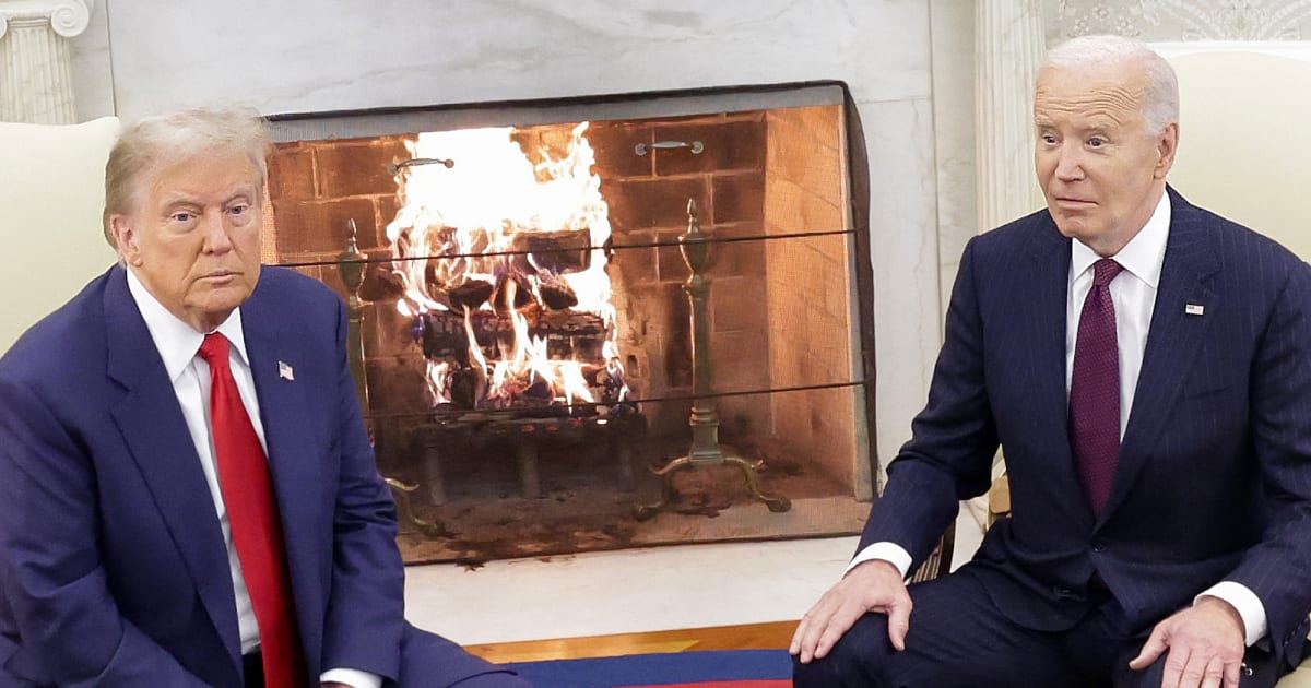
The viral image was shared widely across multiple platforms, including the official Facebook page of the Denton County Republican Party in Texas.
WASHINGTON, DC — A social media graphic contrasting inflation trends under Joe Biden and President Donald Trump has been making the rounds online. The post breaks down purported price shifts across 12 common household essentials and utility services throughout each administration.
Because the two leaders governed during entirely different windows, the timeline used in the graphic is critical for evaluating its accuracy. Joe Biden held office from 2021 to 2025, while Donald Trump’s tenure spanned 2017 to 2021 before he re-entered the White House in 2025 for a term slated to conclude in January 2029.
Claim: Inflation hit US families harder under Biden than Trump
In September 2026, a graphic gained traction on Facebook arguing that the cost of living surged at a much higher rate under Joe Biden than it has during President Donald Trump‘s second term.
The post asserted that overall inflation—the pace at which consumer prices rise over a given period—was significantly worse during the Biden administration.
Echoing this sentiment, one social media user wrote, “Inflation hit American families hard under Biden.”
Beyond individual accounts, the graphic surfaced on several partisan pages, such as the Denton County Republican Party in Texas, alongside widespread shares on Instagram, Threads, and TikTok.
However, the comparison itself is deeply flawed. The graphic weighed Biden’s complete 48-month term against a mere 20-month snapshot of Trump’s second term, spanning from January 2025 to August 2026.
Since economic conditions fluctuate constantly, a valid assessment requires evaluating equal spans of time—such as comparing the first 20 months of both presidencies side-by-side or looking at their full four-year terms.
Ultimately, the graphic purported to show that household goods and utilities experienced much milder price growth under Trump’s current term compared to the previous administration.
Fact Check: False; the graphic is AI-generated
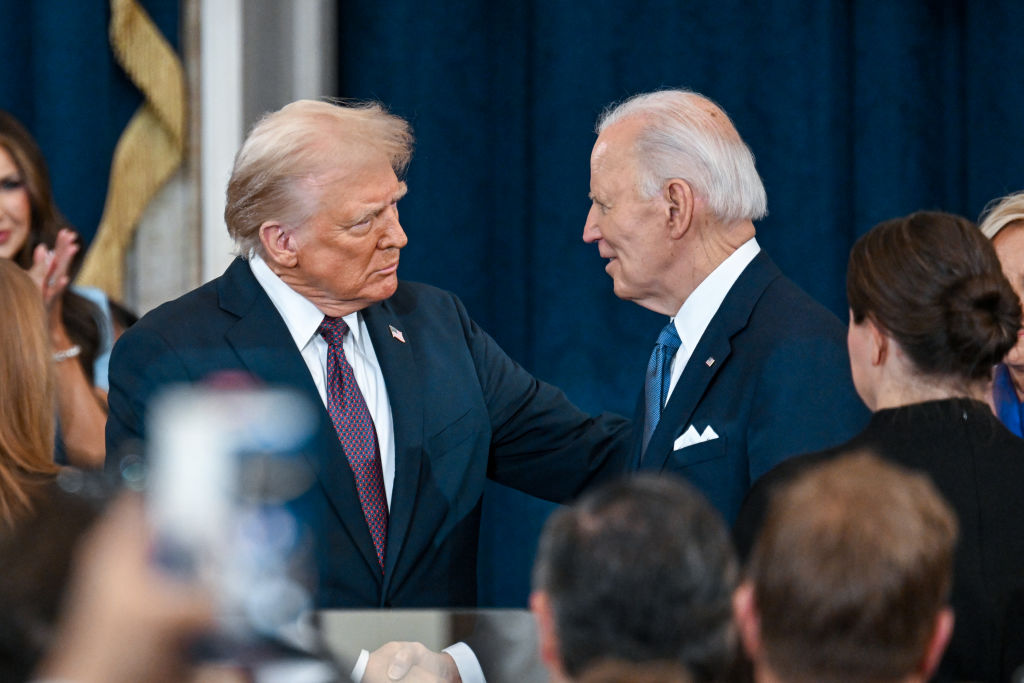
The assertions made in the post are incorrect, and the origin of the graphic remains murky. Pangram, a specialized AI detection software for text and visual media, flagged multiple versions of the image as entirely artificial. Additionally, Meta added warning labels to posts featuring the graphic—including the one shared by the Denton County Republican Party—identifying them as AI-generated content.
The graphic purported to draw its figures from the US Bureau of Labor Statistics’ (BLS) Consumer Price Index for All Urban Consumers (CPI-U).
According to the BLS, the CPI monitors cost shifts for goods and services bought by urban consumers to gauge broader inflationary trends.
The agency clarifies that an index reading of 110 indicates a 10% price increase relative to a baseline period, whereas an index of 90 reflects a 10% decrease.
Furthermore, the viral post failed to specify whether it relied on seasonally adjusted CPI figures. The BLS notes that seasonal adjustments strip out predictable, calendar-based fluctuations from data series to provide a clearer economic picture.
This omission is crucial, as utilizing different datasets or adjustment methodologies can dramatically shift the outcome of any statistical comparison.
In short, the Facebook graphic relied on misleading metrics, pitted an entire presidency against a partial term, and utilized unverified information. It remains unconfirmed whether artificial intelligence was used to fabricate the underlying figures or simply to design the visual presentation.